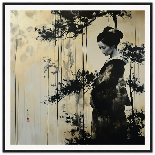
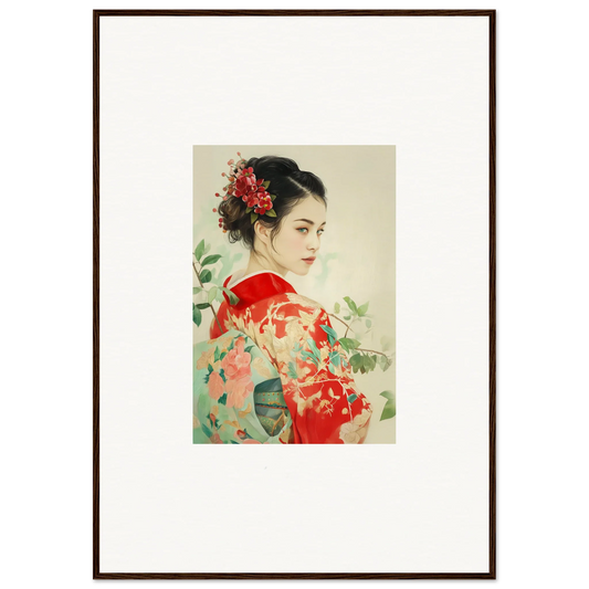
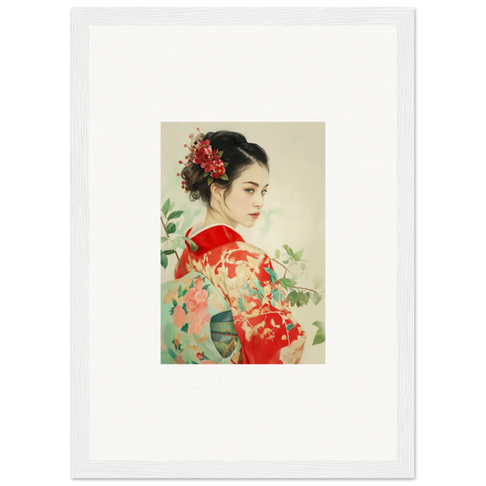
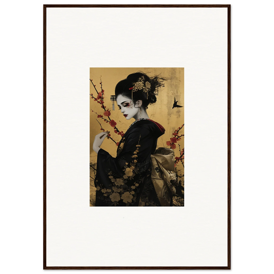
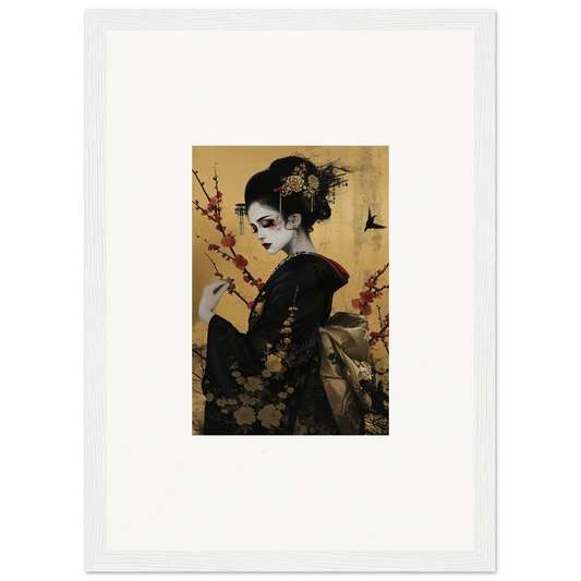
Discover the Beauty of Color Theory
Discover the Beauty of Color Theory
Overview
What is Color Theory?
Color theory is the study of how colors interact and how they can be combined to create visually appealing designs. It explores the relationships between colors and the emotions they evoke. By understanding color theory, designers can make informed decisions about which colors to use in their work. It's like having a color wheel as your secret weapon, guiding you to create eye-catching and harmonious compositions. So, if you're ready to dive into the world of colors, let's get started!
Why is Color Theory Important?
Color theory is not just for artists and designers. It plays a crucial role in various fields, including Demi Method Makeup. Understanding the principles of color theory allows makeup artists to create stunning looks that enhance natural beauty and bring out the best features. By knowing which colors complement each other and how to use them effectively, makeup artists can achieve harmonious and balanced makeup looks. Whether it's creating a bold and dramatic look or a soft and natural one, color theory provides a foundation for creativity and expression in the world of Demi Method Makeup.
Basic Principles of Color Theory
Now that we've covered the basics, let's dive a little deeper into the world of color theory. Don't worry, we won't go too far down the rabbit hole. Color theory is all about understanding how colors interact with each other and how they can create different visual effects. It's like a secret language that designers use to communicate with their audience. By knowing the principles of color theory, you can create designs that are visually appealing and grab people's attention. So, let's explore this colorful world together!
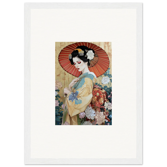
Color Harmony
Understanding Color Schemes
Color schemes are like recipes for creating visually appealing designs. They provide a set of guidelines on how to combine colors in a way that is pleasing to the eye. Just like a chef combines different ingredients to create a delicious dish, designers can use color schemes to create harmonious and balanced compositions. There are various types of color schemes, each with its own unique characteristics and effects. Some popular color schemes include monochromatic, analogous, complementary, and triadic. Each color scheme has its own set of rules and can evoke different emotions and moods. By understanding color schemes, designers can create visually stunning designs that capture the attention and imagination of their audience.
Creating Balance with Complementary Colors
When it comes to creating visually appealing designs, complementary colors are your secret weapon. These are colors that are opposite each other on the color wheel, such as red and green or blue and orange. By using complementary colors in your design, you can achieve a sense of balance and harmony. Just like yin and yang, these colors bring out the best in each other. They create a dynamic contrast that catches the eye and adds excitement to your composition. So, the next time you're looking to create a design that really pops, don't forget to harness the power of complementary colors!
Using Analogous Colors for a Harmonious Look
When it comes to creating a harmonious look in your designs, analogous colors are your secret weapon. Analogous colors are a group of colors that are next to each other on the color wheel. They share similar undertones and create a smooth and pleasing visual experience. First images that come to mind when thinking about analogous colors are beautiful sunsets or vibrant flower gardens. By using analogous colors, you can achieve a sense of unity and balance in your design. Whether you're designing a website, a logo, or even a painting, incorporating analogous colors will bring a sense of harmony and coherence to your work.
Psychology of Color
The Emotions Behind Colors
Colors have the power to evoke emotions and feelings. Each color has its own unique personality and can communicate different messages. For example, red is often associated with passion and energy, while blue is often seen as calming and serene. Yellow is known for its cheerful and optimistic qualities, while green represents growth and nature. Orange is vibrant and energetic, while purple is often associated with creativity and luxury. Black can be mysterious and powerful, while white symbolizes purity and innocence. By understanding the emotions behind colors, designers can effectively use them to create the desired mood and atmosphere in their designs. Discover 8 Colors That Represent Happiness in the table below:
Using Color to Influence Mood
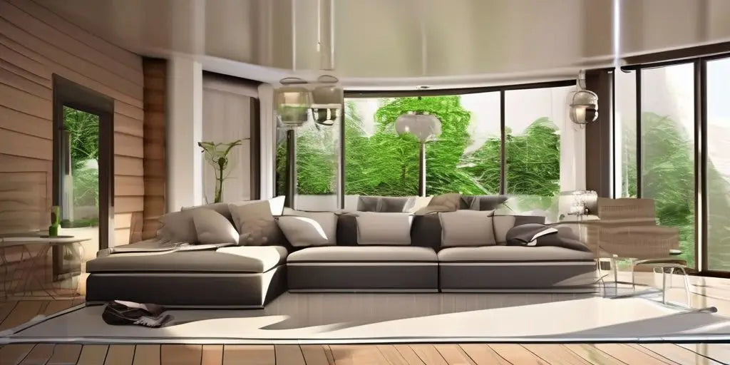
Color has a powerful effect on our emotions and can be used strategically to create specific moods. Where to See Colors Representing Emotions is an important consideration when using color in design. By understanding the psychology behind different colors, designers can evoke feelings of calmness, excitement, or even sadness. For example, warm colors like red and orange can create a sense of energy and passion, while cool colors like blue and green can promote a feeling of tranquility. It's fascinating to see how colors can influence our mood and perception of a space. So, the next time you're designing a room or choosing a color scheme, think about the emotions you want to evoke and consider the power of color.
Color Associations in Marketing
When it comes to marketing, colors play a crucial role in capturing the attention of consumers and conveying messages. Different colors evoke different emotions and can influence consumer behavior. For example, red is often associated with excitement and urgency, while blue is associated with trust and reliability. Companies carefully choose their brand colors to create a specific image and appeal to their target audience. According to Wikipedia, color psychology is the study of how colors affect human behavior and decision-making. Understanding color associations in marketing can help businesses create effective branding strategies and connect with their customers on a deeper level.
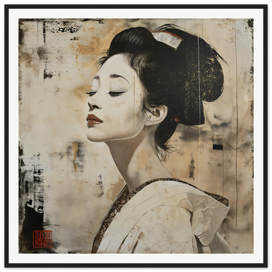
Conclusion
Applying Color Theory in Design
When it comes to design, understanding color theory is essential. It's like having a secret weapon in your creative arsenal. By applying the principles of color theory, you can create visually stunning and harmonious designs that captivate your audience. Whether you're a graphic designer, interior decorator, or even a makeup artist, color theory can elevate your work to a whole new level. It's like the best makeup artistry programs in 2023 - it gives you the knowledge and skills to create masterpieces that leave a lasting impression. So, don't underestimate the power of color theory. Embrace it, experiment with it, and let your creativity shine!
Exploring the Power of Color
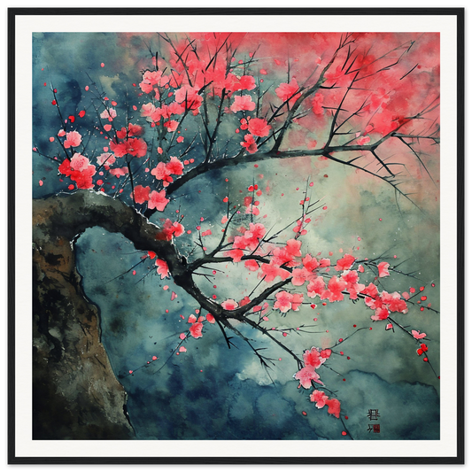
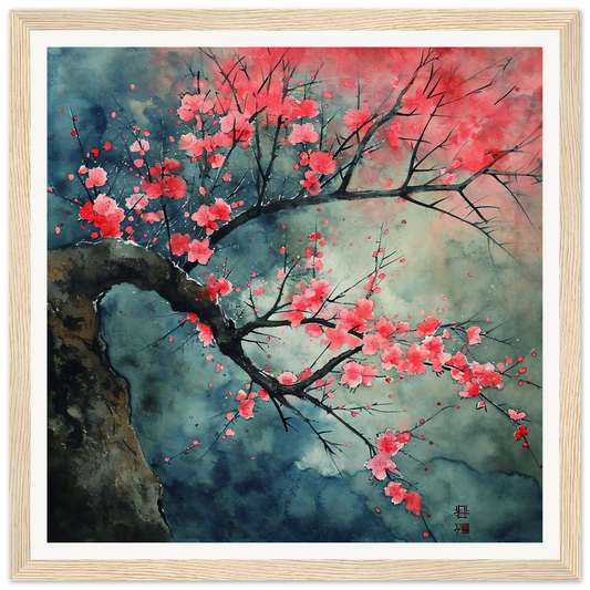
Color has an incredible power to captivate and inspire. It can evoke wonder and curiosity, drawing us in and inviting us to explore. Just think about the vibrant hues of a sunset or the mesmerizing patterns of a kaleidoscope. Color has the ability to create a sense of awe and amazement, transporting us to new worlds and sparking our imagination. Whether it's through art, design, or nature, the power of color is truly something to be admired and appreciated.
Continuing Your Color Theory Journey
Congratulations! You've made it this far on your color theory journey. But where do you go from here? Well, whither you choose to dive deeper into the world of color or simply bask in the beauty of what you've learned, there are endless possibilities to explore. Queer Biology may not be on the agenda, but there are still plenty of exciting topics to delve into. From advanced color schemes to the psychology behind color choices, the adventure continues. So grab your paintbrush and let your creativity run wild!