Japanese Wall Art: How to Get the Japandi Look Right
Share
Japandi — the marriage of Japanese restraint and Scandinavian warmth — is the rare interior trend that keeps growing because it is barely a trend at all. It is a philosophy: fewer, better, calmer. Wall art is where most people get it wrong, so here is how to get it right.
Choose subjects with quiet gravity
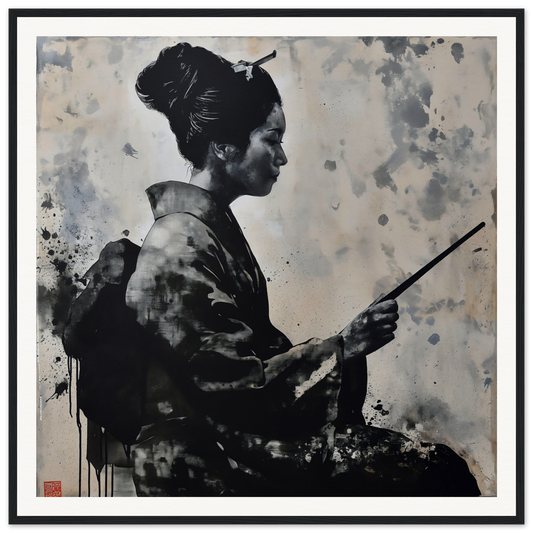
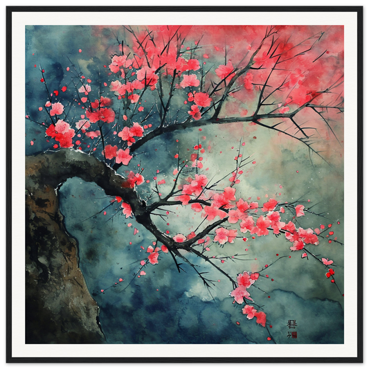
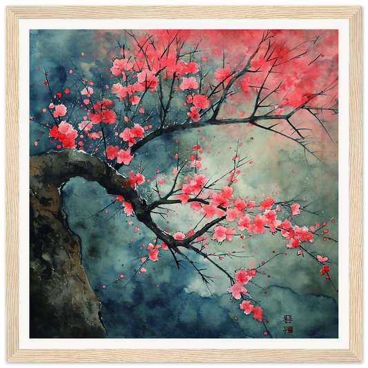
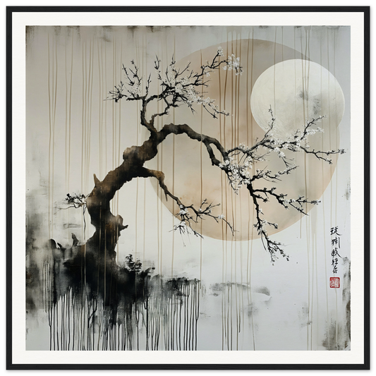
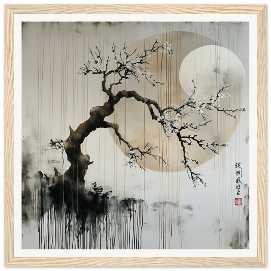
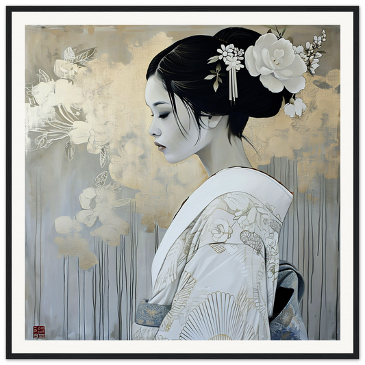
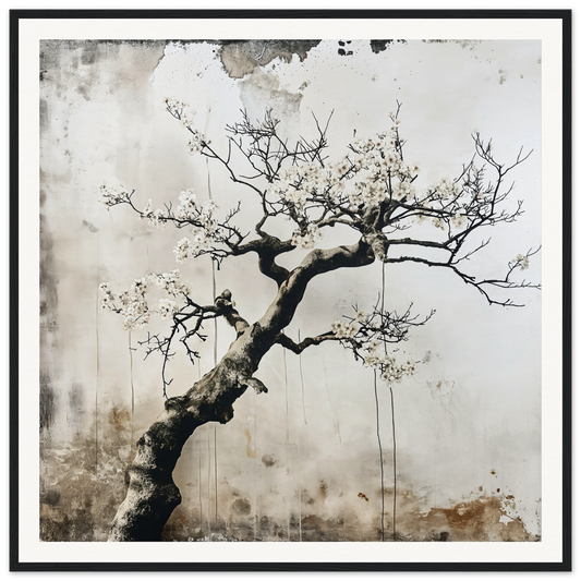
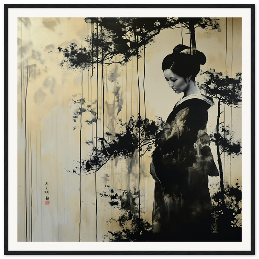
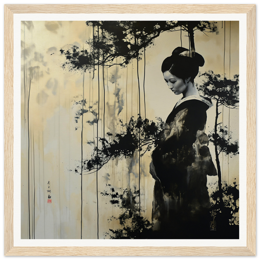
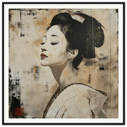
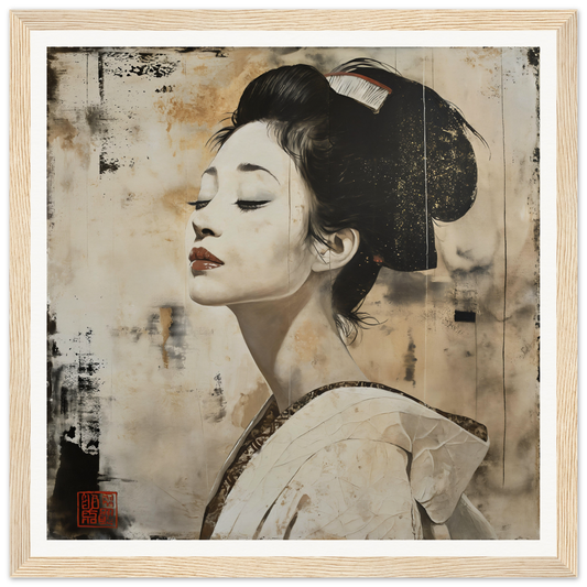
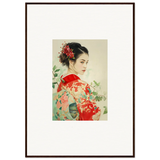
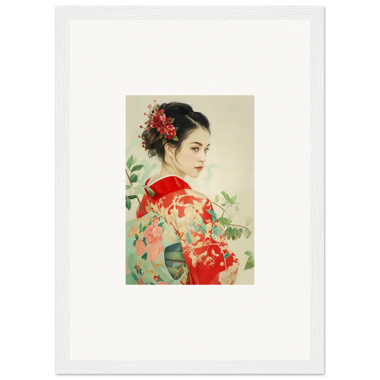
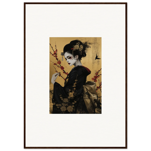
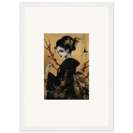
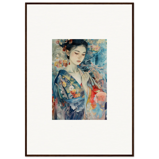
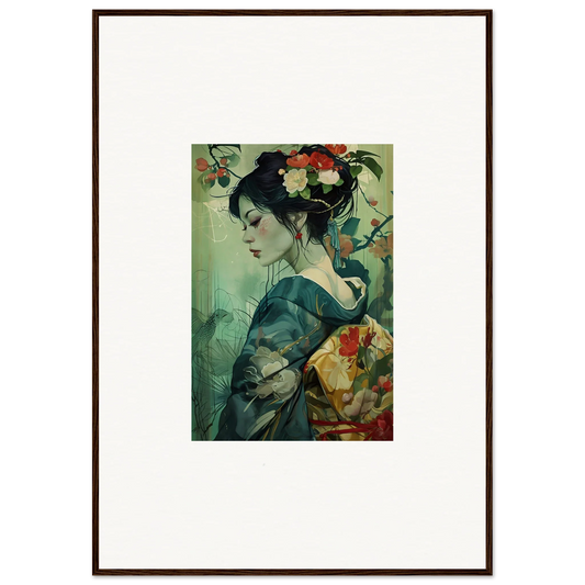
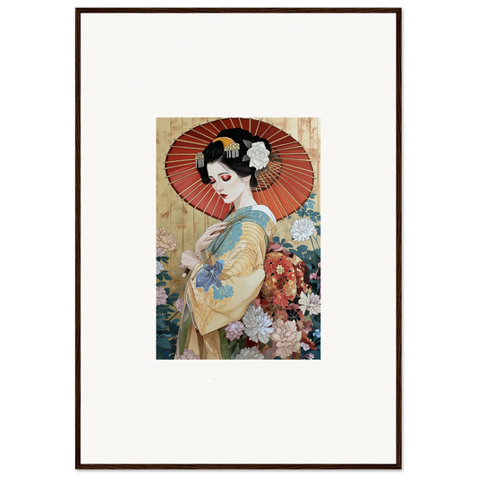
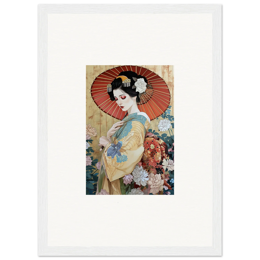
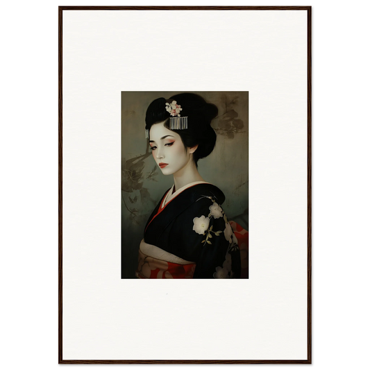
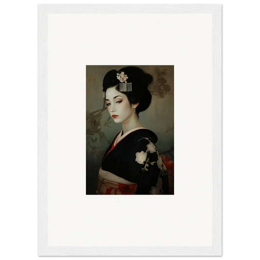
The classic Japanese subjects work because they carry meaning without shouting: sakura (cherry blossom — impermanence), lotus (clarity rising from mud), rain scenes and umbrellas (everyday beauty), and figures in shadow (mystery, restraint). One strong piece beats five weak ones — start with our curated Japanese wall art collection.
The Japandi palette rule
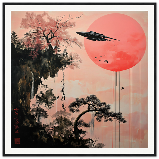
Keep art within a disciplined range: indigo, ink black, blush pink, porcelain white, and one warm accent (gold or vermilion red). If a piece has more than three dominant colors, it will fight your room. Deep indigo pieces above light oak furniture is the single most reliable Japandi combination in existence.
Placement: asymmetry over symmetry
Western styling centers everything; Japanese styling breathes. Hang a single vertical piece off-center above a console and let the empty wall be part of the composition. Pair one large sakura print with a small minimalist line piece rather than two matching frames.
Materials matter
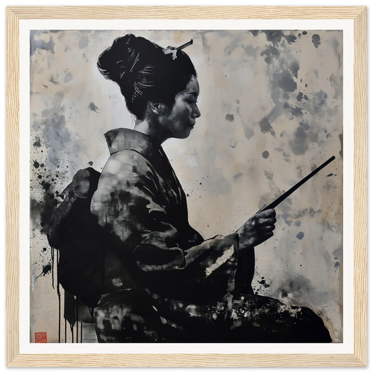
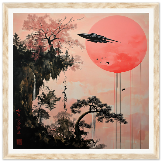
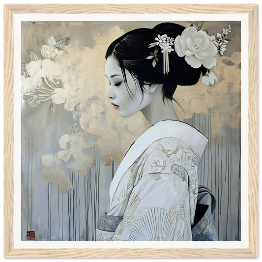
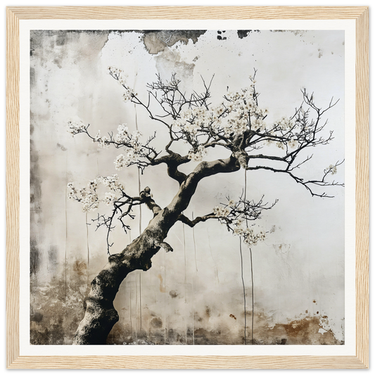
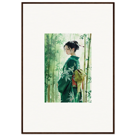
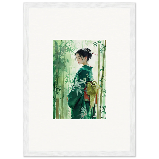
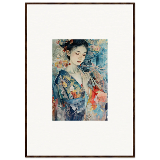
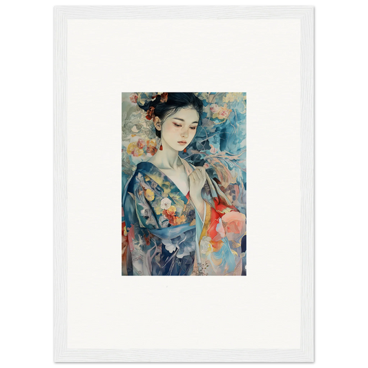
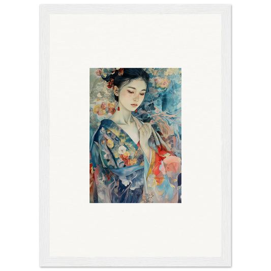
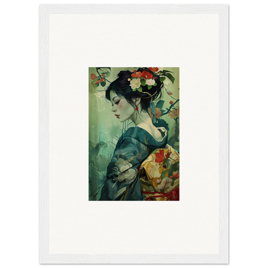
Matte paper behind a thin black or natural-wood frame is the default. Avoid glossy finishes and heavy ornate frames — they contradict the entire idea. For larger walls, an unframed canvas keeps the look weightless; see large-format options.
The one-room starter recipe
Bedroom: one 60–90 cm night-sakura or rain-scene print above the bed, linen bedding, one paper or ceramic lamp, nothing else on that wall. That is Japandi. It costs less than a duvet cover and changes the room more.